
Naive design. It’s not sloppy, it’s strategic.

A scribbled drawing of a thought bubble.
The hot design trend of 2026 that is taking a stance against AI perfection.
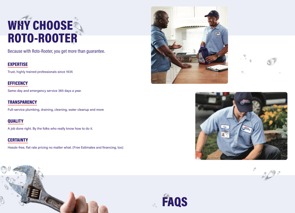
Abandoned concept of water droplets manually added over the Roto-Rooter website.
A year ago, I pitched a client on introducing water splashes into the design aesthetic across their website. It wasn’t a completely random idea—they had OOO and social posts to support that visual treatment, and the service they provided dealt with water. For the most part it made sense, but where we struggled bringing that element (pun intended) into the visual was that every time we asked AI to randomize water splashing, it was—well—too perfect. It didn’t look natural. When we proposed that we manually add the water droplets afterwards, the team balked at the sheer effort and the idea was canned.
Months later, the concept of manually adding imperfections was a growing trend. The going term is Naive design. It’s a wavy line, hand‑lettered type, offset layouts, copywriting that sounds like it comes from a human’s mouth and not a robot. It’s using em‑dashes ironically.
Design trends tend to return the pendulum following disruptions in technology. Pre‑AI, it was systematic, overly polished whitespace. This was something easy for AI to replicate, over and over and over again. So it’s no surprise that designers are now breaking that pattern for their work to stand out, and it’s also no surprise that customers and brands are starting to take notice.
Why (some) brands should start paying attention
The act of introducing deliberate imperfection into a design is not a brand taking a stance against AI. In fact, it’s almost the opposite. It’s a brand being self‑aware that AI is a formidable force in how we all live today. It’s saying, “I know that you know we’re using AI, and we are confident with how we use AI in our design.” Most importantly, it’s sending customers a trust signal. And instilling trust is something all brands should be doing right now. There is so much AI slop out there, coming out at a rapid pace. Customers are yearning for a brand they can rely on.
Designers are responding by deliberately adding imperfect, human elements to differentiate from AI’s polish. Brave companies, who are willing to bring humanity into their brand, are winning.
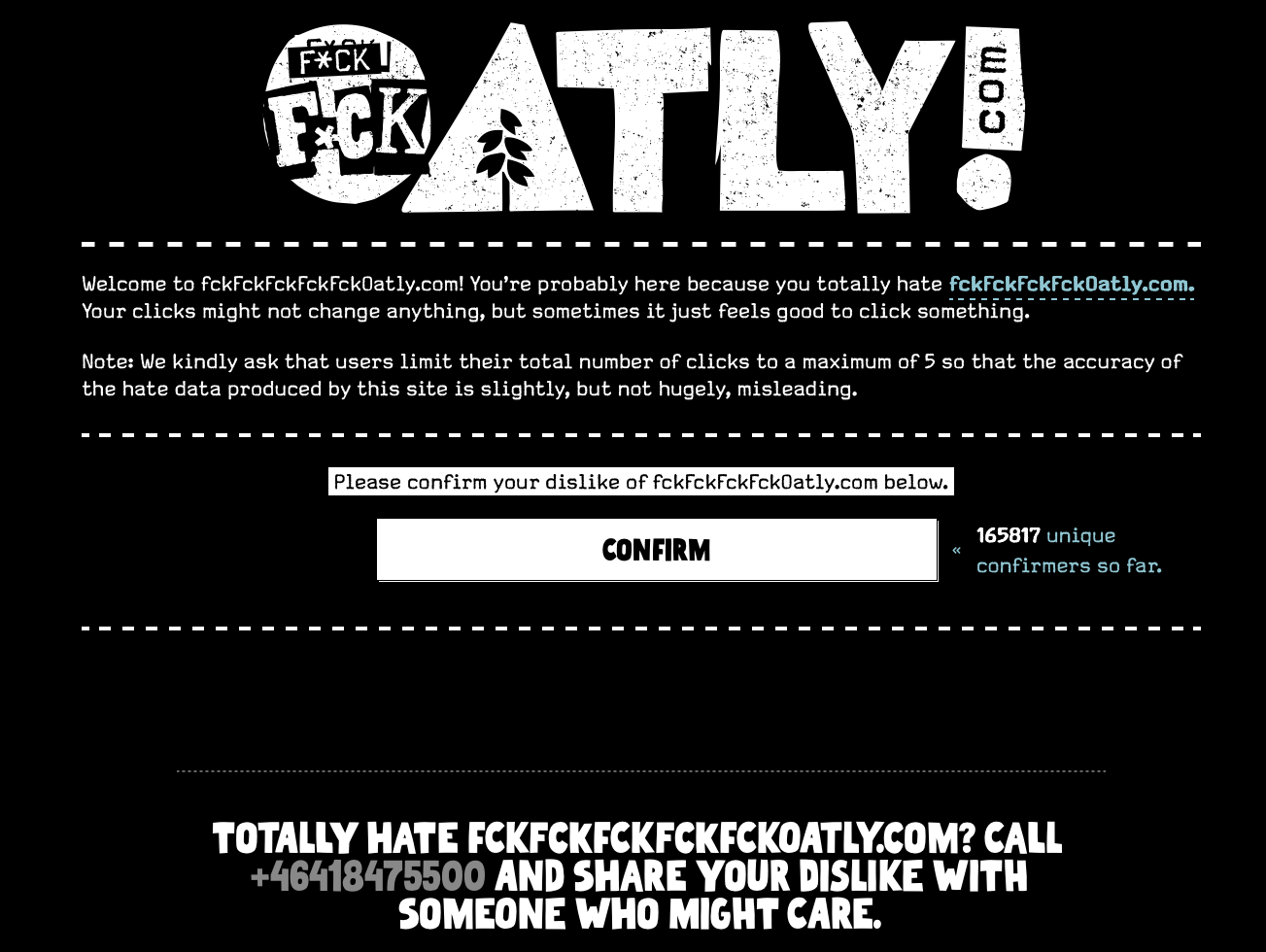
Screenshot from a deep easter egg on Oatly.com. Note: Not my design.
Look closely at what some of the biggest companies are doing out there, and you will easily see ways they are trying to inject authenticity into their brand. Anthropic, one of the biggest players in AI, uses hand‑drawn images in its branding and interjects silly copywriting in its footprints. Oatly, one of the leading oat milk products in the world, is having a blast with hand‑drawn type, offset layouts, and fun copywriting. Nike, often regarded as the best branding in the world, uses grainy, blurry images with harsh natural light.
On the flip side, the companies who are relying heavily on AI‑generated designs, layouts, images, and copy could be headed into troubled waters. According to a study by Double Verify “42% say a brand’s use of low-quality or ‘uncanny' AI-created advertising would negatively affect their opinion of the brand”. This seems to be more relevant with Gen‑Z; Rival Technologies reports that “72% of Gen Z consumers have taken direct action against a brand after encountering AI-generated marketing, from unfollowing and unsubscribing to complaining publicly and walking away from a purchase.”.
“72% of Gen Z consumers have taken direct action against a brand after encountering AI-generated marketing...”
As for the brands using AI in their design process, the backlash is not necessarily THAT they are using it. It’s that they are using it lazily, without obvious human intervention, attention to detail and prioritizing speed to market over quality of output. It’s making their brands feel less human, less authentic, and less connected to their customers. Gen Z is sniffing that out; if they see obvious AI use in a design, and then see the same company celebrating efficiencies due to AI‑driven processes and reporting layoffs—well… they see that em‑dash as a negative.
How to keep your brand authentic
Naive design, and the broader anti‑AI crafting movement, might have yourself asking: “How can we tap into this momentum without tarnishing the trust and authenticity we have already built up?” It’s a great question to ask. You don’t want to haphazardly uproot your tone and voice, or start putting a bunch of scribbles and mistakes into your output. Also, naive design isn’t an excuse to be lazy; the aspects you adopt should be intentional.
A great place to start is to audit your brand and make a “do not touch” list. Ask yourself what are the human aspects of your brand guidelines that you can accentuate. Maybe photography would be better suited being shot with real people in real spaces. Maybe you could interject more life into your copy. Maybe your iconography could be sketch‑style instead of a generic icon set. Maybe your headline font is so established that it would feel like a new brand if you replaced it with handwritten text. It’s important to use naive design as an accent layer, not an overhaul.
Exploration of a homepage where you got to play with the brand’s accent shapes.
I chatted recently with my CEO who wanted to replace our colour palette. For context, our current palette used stark black and white as their primary with small hits of bright neon teal, yellow, and red. The company is a tech company and emphasized having a great human‑first culture. My recommendation was to not touch the colour palette. Black and white is binary, which works well for a tech company. The bright accent colours is how we represent our people. So, while the colour palette remained untouched, it opened us up to use the accent colours in more sporadic ways. It was a small tweak to the brand that made a big difference.
A framework to apply naive design to your brand
Audit the brand guidelines.
Decide what goes on a “do not touch” list (name, core mark/shape, hero color).
Analyze the remaining brand elements for what human aspects they represent.
Explore how you could recreate the selected brand elements in a naive way.
Whittle multiple approaches down to a few favourites.
Assess approaches with executives and stakeholders (those who steward the brand day to day).
Settle on one direction and establish the rules. Ex.: Elements should help drive sight lines. They should be used on less than 5% of the visible canvas. Line weights are standardized. Accent colours should never be used in consistent patterns. Protect hierarchy and accessibility. Imperfection must never become friction on high‑stakes surfaces.
Pilot in small campaigns or on small strategic releases and define success metrics (engagement, time on page, brand trust signals).
If successful, prep the files and update the design system.
Roll out more widely with updated brand guidelines, documentation, assets, and instructions.
Monitor analytics, social listening, and A/B tests; refine execution rather than locking a rigid final version.
Good luck and happy crafting.
If you need help, you know who to reach out to.